Hey @Ruben, thanks for submitting this idea to the Mozilla Connect community! We encourage you to add details to the main post or comments section—this is where you state your case and explain why you believe thumbnails should be on the right, what problem that solves, or even why it works from a design perspective.
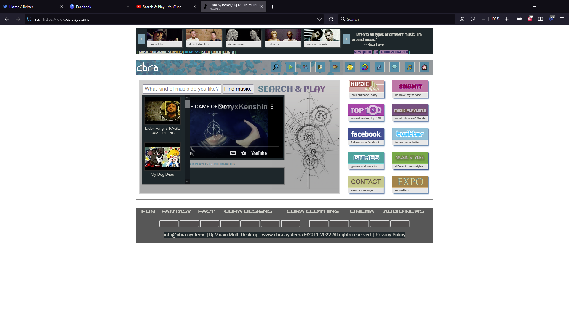
Dear @Jon. I started this website: www.cbra.systems as a hobby. Because I like music. If you click on the magnifying glass on the main page you will get the page "Search & Play". I think I like having the thumbnails on the right side better because that's where the page ends. 'Cause of the scroll bar. Optically I think it is better for the entire experience of the website to put the thumbs on the right side. Now it is that if I do it on the left, the distance of the cursor does not have to move as far as you work with it.
The thumbnails on the left, the audio-video player will be approximately in the middle. The scroll bar is also placed on the left side next to the thumbnails. The idea is that the mouse pointer has to travel less distance to use the page.
The thumbnails on the right, so also the scroll bar on the right of the page, the video player then comes on the left. I think it looks nicer myself.
This does not look like a Firefox bug. You are using https://developer.mozilla.org/en-US/docs/Web/CSS/::-webkit-scrollbar which is not supported in Firefox so the scroll bar is thicker than on Blink based browsers which may cause content to not fit inside the provided element. This seems like something that would need to be solved by the site using a cross browser custom scrollbar style.
@Jon and @KevinBrosnan Thank you, that's it... I'm using the developer version of FireFox... I've hired someone from Croatië to fix the problem that the thumbs where on the left side. IDK how he fixed it but it is fixed now.
Hi, @KevinBrosnan, I use this version of the Firefox Browser 97.0.1 (64-bits). I think you're right and this is a Developer version. Indeed the scroll bar is thicker. @Jon I've hired someone from Croatia to fix the thumbnails to the right.